Lorem ipsum dolor sit amet, consectetur adipiscing elit, sed
do eiusmod tempor incididunt ut labore et dolore magna
aliqua. Ut enim ad minim veniam, quis nostrud exercitation
ullamco laboris nisi ut aliquip ex ea commodo consequat.
Duis aute irure dolor in reprehenderit in voluptate velit
esse cillum dolore eu fugiat nulla pariatur.
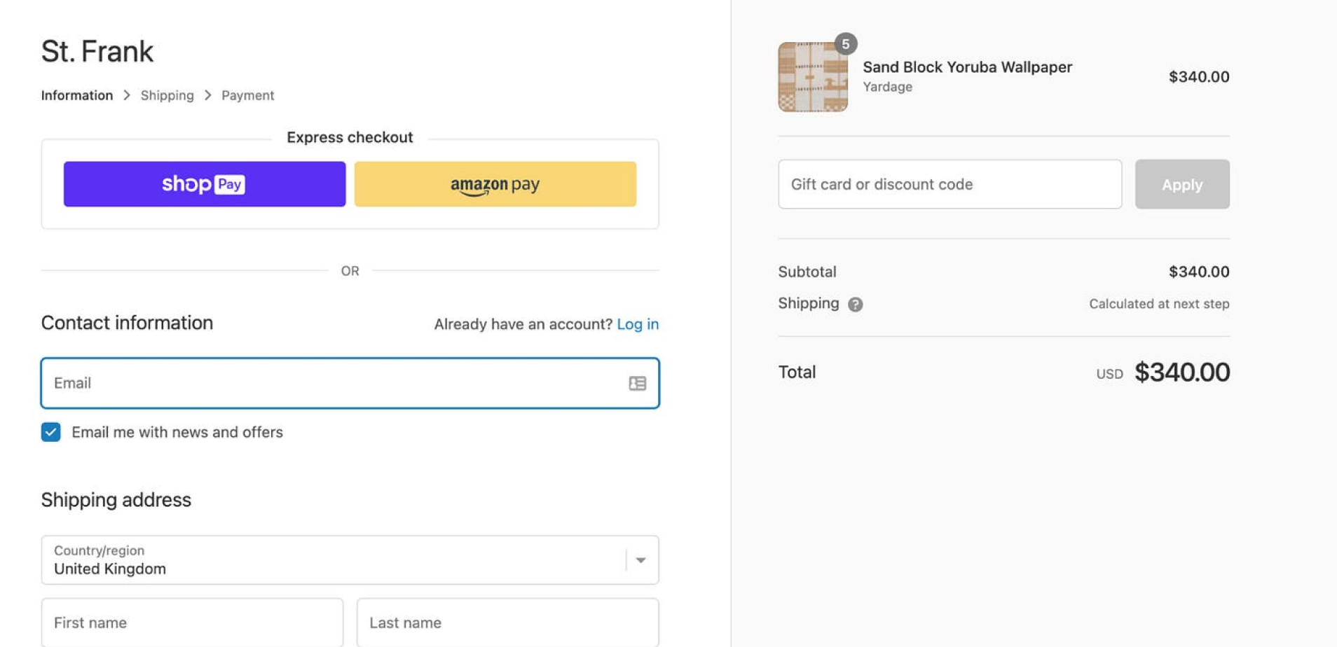
Example: A business wants to redesign its e-commerce
website. By analyzing user data, they discover that a
significant number of users abandon the checkout process
on a specific page. With this insight, the design team
decides to simplify the checkout process by reducing the
number of form fields, resulting in increased conversions
and improved user experience.
When a website feels confusing, the first instinct is
usually to blame execution. The design must be off. The
navigation isn’t clear enough. The copy needs tightening.
Someone suggests a refresh. Someone else suggests a rebuild.
Occasionally, that’s true. More often, it isn’t. In many
cases, the website is doing exactly what it has been asked
to do. The problem is that what it has been asked to do is
unclear, conflicted, or unresolved — because the business
itself hasn’t made certain decisions yet. Websites don’t
invent confusion. They reflect it.
Confusion is rarely accidental
Most businesses don’t deliberately create unclear websites.
They arrive there gradually, through a series of compromises
that feel reasonable at the time. A new service is added
before the old one is properly retired.An offering changes,
but the language around it doesn’t quite catch up.Two
internal stakeholders disagree on positioning, so the
website tries to accommodate both. None of these decisions
are irrational. They’re often made to keep things moving,
avoid friction, or preserve optionality. The issue is that
websites are not good at holding unresolved thinking. What
feels like flexibility internally quickly turns into
ambiguity externally. The site begins to explain instead of
assert. It hedges. It qualifies. It tries to be accurate
rather than clear. To the business, it feels nuanced.To the
visitor, it feels vague.
Websites are where indecision becomes visible
Internally, ambiguity can survive for a long time. Teams
work around it. Conversations fill the gaps. Context is
shared verbally. Everyone knows what is meant, even if it’s
not written down cleanly anywhere. A website removes that
buffer. It forces decisions into language, structure, and
hierarchy. It asks questions the business may not be ready
to answer clearly: Who is this for? What do we actually do
now? What matters most? What no longer does? When those
questions haven’t been resolved, the website absorbs the
tension. This is why so many sites feel overloaded. Not
because the business does too much, but because it hasn’t
decided what to lead with — and what to let go of.
The telltale signs are easy to spot
You can usually see this kind of confusion without being a
designer. The homepage tries to speak to multiple audiences
at once, none of them particularly well.Service pages read
like internal documents rather than external offers.Language
becomes careful and non-committal, full of qualifiers and
broad statements.Navigation expands as a substitute for
prioritisation. Often, there’s a sense that the site is
“technically correct” but strangely unconvincing. It
contains information, but it doesn’t give direction. It
answers questions, but it doesn’t lead the reader anywhere.
This isn’t a design failure. It’s a decision failure.
One of the reasons this persists is that clarity has a cost.
Being clear usually means narrowing focus. Narrowing focus
means not everything gets equal weight. That, in turn, means
someone internally feels sidelined. A service gets
deprioritised. A legacy offering loses prominence. A future
idea doesn’t make the cut. Avoiding those moments is
understandable. They can be uncomfortable, political, or
emotionally charged. The website becomes a convenient place
to defer them. Everything stays visible. Nothing is fully
resolved. The result is a site that feels busy, cautious,
and strangely hollow.
No amount of polish fixes unresolved thinking
This is why redesigns often disappoint. The typography
improves. The spacing gets better. Animations are added. The
site looks more modern. And yet, the underlying discomfort
remains. Something still feels off. That’s because
presentation can’t compensate for indecision. You can refine
a structure endlessly, but if the structure is built on
unclear priorities, the result will always feel slightly
unstable. At a certain point, more design stops adding value
and starts masking the real issue.
What’s usually being avoided
In many cases, the website is confusing because the business
hasn’t yet decided one or more of the following:
who its primary customer actually is
which offering matters most right now
what it is willing to stop doing
how it wants to be perceived versus how it currently
operates
Until those questions are addressed, the website will
continue to carry the weight of that uncertainty. This is
why attempts to “clarify the site” without addressing the
business itself tend to stall. You can only simplify what
you’re willing to define.